kayboard Hey Timo, I would prefer a kind of book, like the draft from the logo designer (1 or 4) and a dip pen (but not stilstic). Cheers Kay
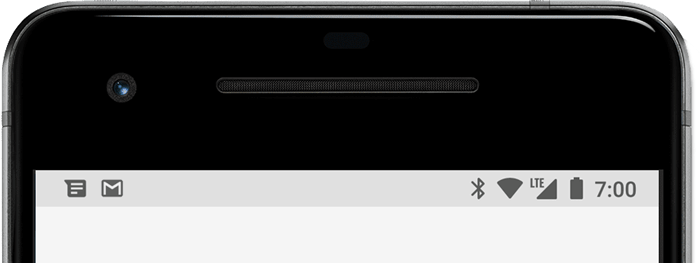
timo kayboard Thanks for your suggestions. I think this logo would be way to detailed - it wouldn't work when the logo is scaled down and shown as a small app logo. I am looking for simple shapes, that work even when only a small pixels wide (e.g. when it is used as a notification logo on Android, when the logo is shown in the top info bar):
gaynel13 Hi, I personally like C3 because it's large and there's no other logo like it. I am an older adult and making icons as large as possible is important. I definitely like your app and appreciate it. Thank you very much.
vbhr About the M1, I would change the color to a darker blue and with no shadows. About the logos, I like the ones that are single feather (9, 13, 14 on page 1). I don't like the ones that looks like a calendar (like 15, 16 and current logo).
ThomasFAustria I would prefer the current logo. No multi coloured. The book design is also quite nice, could have less details. (Post #54 Thursday, November 14, 2024 5:02 PM) Please not change to the minimalistic (Post #52 Thursday, November 14, 2024 3:53 PM)
Danni timo page 1, sketch 19 looks great. There are way to many app icons with fethers, so choosing something completely different is a great idea. I also like the sketch because it was the one catching my eye. I am visually impaired, and page 1 sketch 19 was the most recognisable icon on smaller sizes.
rinny93 I think the current logo is fine. If you want to try something different, can you try the current logo feather with a book background?