I just migrated from another app (Quillio) for efficiency reasons. I chose Diarium because it is the best journaling app out there in terms of features.
However, I find the timeline view design to be too compact, simple and boring. Like it's hard to visually differentiate one post from the other: they are all "joined" together, separated by just a thin line. When they have tags (especially colored), it becomes much more pleasing and discernible, but, if not, to my eye the text from different entries seems to be too close, like with no padding.
In addition, the fact that the title text has the same size as the body text also does not look very appealing to me. I think the title should be a bit bigger to stand out.
Also, apart from the tags and images, the coloring overall seems very monotonous, with little contrast and everything having a dull greyish and blueish (in my case) color. For instance, it's like the day number on the left is trying to stand out, but it kinda doesn't.
Crazy anecdote but, as soon as I migrated to this app, I felt unmotivated to keep the diary going (even tho I have been consistent for 2 years), mostly because of this timeline view. Like, visually and psychologically, my posts seem to be unimportant in Diarium, because of the things I mentioned before.
In contrast, in Quillio, every entry seems important, and it makes me want to put effort into writing them. I think this is because the entries are big separated bubbles and more "attractive" overall:
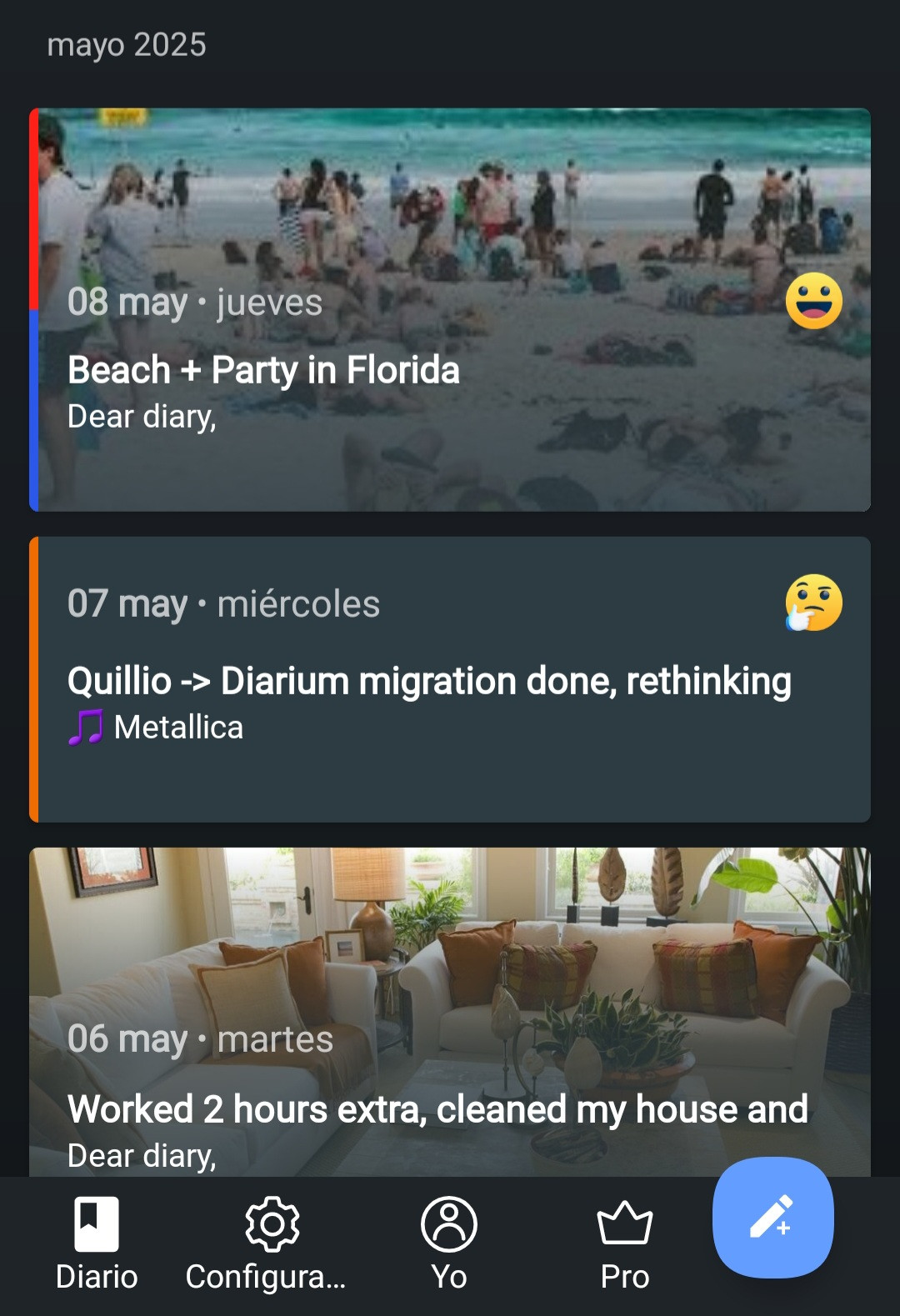
Of course, entries taking too much space is a disadvantage, and it will make the timeline view less practical, like having to scroll more or viewing less posts on the screen at a time. Still, I think we can find a middle ground. And do people even scroll a lot through timeline view? With search + calendar navigation tools available, it does not seem very practical. Idk.
But entries being more separated is a must IMO, because it makes it much cleaner. Right now it looks so cluttered. From the original feature request post, I personally like the 4th (the cyan colored one) and the 5th options, but with some adjustments.
I just wanted to share my thoughts and experience. I strongly believe the timeline view needs a rework, but a broader discussion and hearing more users' opinions will be necessary. I have gone through all the "in consideration" feature requests, and the vast majority seem to be QOL changes, which shows how complete Diarium is in terms of features. But i find it lacking in design, and I humbly and respectfully think the dev should focus on this aspect as of now, especially the timeline view (with no pressure of course).


